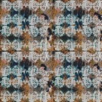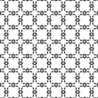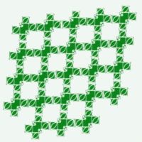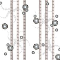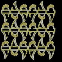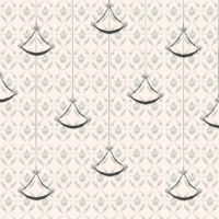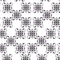
For my own symbols I chose a Globe Flower lace and my key rings. I wanted to pick my traditional symbol from crafts and find something I have at my place. I chose a tablecloth my mother has made where is a floral Globe Flower pattern. Finland Globe Flower is quite common in some places but some places it doesn´t occur at all. I remember that my grandmother used to like this flower and she had some in her flowerbed. I chose my key rings because it consist lot of memories about places I have been and lived. It´s an everyday object. Keys themselves have a symbol meaning to open places. Lace pattern symbols my roots, key rings my travels and moving to place to place and my interest to different places and to see many places in the future too, but still being happy about experiences already achieved.
What our group’s symbols had in common were shape (roundness) and bright yellow color which sun, Globe Flower and some bubblegums had. Keys and VW car brand have technological meanings. Car and my key rings symbolize travelling, sun was about regeneration like seeing new places.
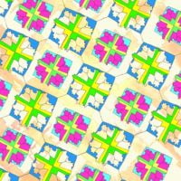
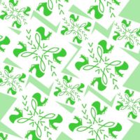
In our mix of symbols we chose my Globe Flower and Deryas VW symbol, her bubble gum colours and one of Klintas sun symbols. I start to add others symbols to my Globe Flower frame which was good adding others symbols in it as well as my own symbols. Derya add her touch to pattern with watercolors and Klinta concentrated on colour choices. We use bubblegum colours and Klinta develop the idea by adding her childhood candycolours to pattern as well. To final version of our pattern there is Klintas neon colours and new layout and Deryas background with my pattern version of mixing symbols.
Our design strength was colours and that every symbol can be seen and they are equals. Patterns background is lively and soft. Neon colours bring edge to our pattern.
Now I think our pattern looks like kites which fly with the wind to see new places. Kites are excited to see new places, but they know where they come from. Our pattern looks quite traditional but with a twist, new bright and surprising colours in it. Sun and Globe Flower symbolize nature, VW logo technology and traveling. I see regeneration in our pattern which the sun symbol was about. Colours are playful which were inspired by bright candycolours. Pattern is fresh and vital.
– Elisa – |

Group U pattern |

The whole transcultural pattern project began with choosing two symbols that was supposed to mean something to the participants. My choises were the dove, a symbol of peace and purity and the corn spike, a symbol of fertility and rebirth. Both symbols are widely used in the Christian symbolism and elsewhere. Other symbols used in our group were eagle, air, sun and amber. After designing patterns of our own based on the chosen symbols the group members started to edit patterns together.
During our project we did bat our patterns around Latvia, Germany and Finland in our wiki site. Our group worked with photo manipulating programme PhotoShop (Germany) and vector graphic programme FreeHand (Finland) and also painted by hand (Latvia). The german student started the pattern editing by designing the basic shapes and colors and after that I continued with
vector graphics by editing the shapes, sizes and the layout of the design.
After re-editing and re-re-editing we ended up with quite abstract design where you cannot find the original symbols that easily. Hopefully the watcher sees the spikes sway in the sunny wind with fresh colors and vibrant shapes. I enjoyed this project although we did not meet each other at all. Students with different picture editing skills could cooperate nicely.
– Helena – |
 |

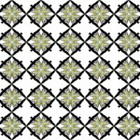
We chose three symbols for the intercultural symbol. Those symbols are the Karelian coat of arms (Finland), the pressure (Germany) and the gyro (Latvia). All the selected symbols represent the home countries or towns of the group members in some way.
We think that the new pattern includes same meanings as the original symbols had. The blue color reminds of the German participant’s hometown, which is located by a sea. The pattern has the same kind of dignity as the Karelian coat of arms has. The layout is playful, which reminds of the Latvian song and dance festivals.
– Irinja – |

I chose my symbols from a brooch of Kalevala Jewelry and an old shoelace. There is a little bird in the brooch. It symbolizes freedom and lightness for me, but the important thing is also the nature, where birds are living. Shoelaces pattern symbolizes my roots, but it has also a traditional meaning for me. My transcultural pattern was like a small owl.
I made intercultural pattern with Marlien, because the third person of our group didn’t come to work with us. We chose to work with my bird-brooch and Marlien’s plaice-fish. The important meanings behind them were nature, freedom, vitality and lightness. They symbolize a little bit different things for us, but still we both have a very close connection to the meanings of the pattern.
We made a wingfish-pattern. Our cooperation was good, although it was quite difficult communicate in English, but language of pictures simplified it.
– Valpu – |

Each one of our group presented two symbols from which we picked up one from each. That meant we had three symbols for our intercultural pattern. The symbols had a common theme since they all were about kings, gods and godhood. The three symbols were Jumis Latvian pagan god, a necklace that expresses the Viking god Thor’s hammer and a lion which is the traditional symbol in Germany and can be seen in several flags.
I think that the pattern expresses power, strenght and motion. The power comes from the original symbols already but our pattern gives the viewer an impression of motion because it resembles a rotating wheel, windmill, or in simplicity an ongoing force. To me the pattern is also about mental strength and going forward in life. There is a saying in finnish that describes this pattern: ”a rolling stone doesn’t moss.”
-Laura- |

In my opinion the pattern describes that there are harder times (blueberries), and between them there are good times (stars) in life. Block, which is sideways, is the symbol of my roots, that makes me push through the harder times towards the better times and gives me joy in the good times.
The planning process was very enjoyable. It was nice to create and encounter new challenges. The particular challenge was that we needed to express our thoughts and ideas in foreign language. In the end, I’m satisfied to the end result, and the process left a bunch of good memories.
– Jenna – |
 |
| For our team design work we chose three symbols: the seagull, the tree and the God’s sight symbols. Design work proceeded via textile-cultural dialogue via wikispaces and dropbox with lots of usage of different image processing programs and discussions. First we selected the symbols for our work together, next we tried different combinations between the symbols and different structures of patterns with both a few and many components. Finally colouring was added into the pattern.
I’m very happy with the final pattern. Design strengths of the pattern could be the fresh and modern look of it, there is also fun, suprise and mystery in it and it is possible to interpret or read the pattern in many ways. I think it would suit well for different kind of textiles for example clothing or interior fabrics printed by hand- or machineprinting techniques as repeating few or many printing units.
I think all the three symbols can be found in the pattern but it is mysterious. There could be seen the meaning of connection to the nature. The seagull describes freedom, motion and influences between people and cultures. The tree describes something exemplary and it includes the meaning of protection. The third symbol is more mysterious. It could describe the connection between dimensions of possibly spiritual nature present in surroundings often in mysterious ways. The message of the pattern could be ”look more closely” or ”learning to see”.
– Sanna – |

In the beginning we were supposed to add two important symbols to the wikispace; one traditional and another more personal one. I chose a bear and a four-leaf clover as my two symbols. A bear is the traditional one and a four-leaf clover the personal symbol. A bear is Finland’s national animal. I come from the town called Kouvola and ”kouvo” means bear. A four-leaf clover is a symbol of good luck. If you find a four-leaf clover from the cloverfield it brings you good luck. When I was a child I remember that we were laying on the blanket with my friends and trying to find a four-leaf clover. It was very difficult, but sometimes we succeeded.
Theresa, my german groupmate had selected a potato, as her traditional sign and a kiter as her personal symbol. She said that germans are called potatoes, because they eat so much potatoes. The funny coincidence was that we finns also eat very much potatoes. Kiter reminds her of her dear hobby. She lives near water and watersports, especially kiter is very important hobby of hers.
Our third friend from Latvia introduced herself, but didn’t finally take part in our project. I don’t know why she didn’t show up. At first we had many problems. First we were waiting our latvian friend to add her symbols and we lost many precious minutes. Eventually we decided to do our project without her. Then some technical problems occured. My groupmate added too big files to the wikispace and all the other pictures disappeared. Despite all the problems we managed to finally start our project.
Selecting the symbols actually took place in a way that each made proposals on which the pattern was formed. We selected a bear, a kitter, a four-leaf clover and a potatoflower to be in our intercultural pattern. You can see pictures above in what way the project progressed. We mostly discussed of the colours of the pattern. Also some patterns had too many details and pattern needed to be simplified.
I had some problems with photoediting, because I didn’t have photoshop at home. I didn’t have a chance to work with the university computers, because I had moved from Savonlinna to my hometown Kouvola. I downloaded a free programme called photofilter from the internet, but it wasn’t as good as photoshop. As a result, it was a bit difficult to edit the files that my groupmate had done. I had also forgot my photoediting skills, eventhough we had used photoshop in many courses before.
We finished our project with the help of facebook. It was the easiest way to chat online and exchange opinions how our pattern should look like.
Our symbol reminds me of our teamwork and the whole process. We can find all the important symbols from it. Of course the original meaning is not the same. In the beginning the mening of my own symbol was more personal. Now the meaning is mixed with my groupmates meanigs. Now our new pattern contains many memories of this great project and of my new german friend.
Perhaps the pattern is not what I would like it to be. At least I’m not satisfied with the colours. I also like more sensitive patterns, patterns that have smaller figures. However these are matters of opinions. You can’t satisfy everyone. My groupmate was designing this pattern to her summerdress and maybe this was not the best starting point for creating an intercultural pattern.
In conclusion this project was very nice and I really enjoyed working with my german friend. She was very motivated to do our project and acted responsible way. We are still friends in facebook and she promised to show me her summerdress when it is ready. It is very interesting to see how our pattern fits with her dress design.
– Tanja – |

The projectwork started a bit slow, but when we finally got into it, there were many new ideas and styles that we tried in our works. We didn’t actually make decisions about which symbols to use or in which way so we all could work at our own style. After discussing about meanings of the prints we chose the final pattern which gave a lot of sentimental thoughts from past ages, probably from the ones that we even didn’t even live at.
– Elina – |

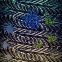
The design process of our intercultural pattern began with introducing our own symbols. We chose for the intercultural pattern the symbols that symbolize our hometowns, my coat of arms of Jämsänkoski, Sarah’s signs of the colliers and Ginta’s sun-symbol. The chosen symbols had also the common cross-shape. I made some first tries in drawing, but Sarah came up with the idea of printing the symbols on paper and connecting them. The scanned version of the combined symbol was scanned and put into a pattern with a computer. Sarah had the idea to print the pattern again and crumble it, and then photograph the paper, so the pattern has visible wrinkles and more texture. At every stage we did many drafts and tries and picked the best ones to work with further. The meanings of the final design are related to the wrinkled shapes: the lines can be seen as rivers or as life flowing in the veins. The pattern combines man-shaped nature and industry with very organic forms and the elements of nature: sun, earth and water. It is a combination of our homes, that are different, but still the elements are the same for all of us.
– Piia – |

Our intercultural pattern is a circle of nature or life. It’s a combination of a grass snake from Latvia, a white stork from Germany and a ring of Kalevala jewelries from Finland. Stork wings and snakes represent sky and ground and rings unites them in a circle. The “grass snake” sign is one of major traditional signs in Latvia and it symbolizes wisdom. The white stork brings babies and it’s a symbol of happiness. Kalevala jewelries are important for Finnish people, the company is old and traditional and all jewelries made in Finland. All our symbols are traditional and they express our culture and personality.
– Heini –
Personally for me our patterns reminded a never-ending circle or a route for nature. Not only for three of us, I think for everyone, nature is an important and even standard value. So that the meaning of the pattern could be expanded in many variations. It is like movement when everything changes and in the same time everything stays as it was.
– Ilze – |

At the beginning of the project we presented ourselves and our two symbols on the wiki. Since then, we chose three symbols, which we would use for our intercultural pattern. I proposed three symbols for the starting point. The three symbols I suggested had all religious or superstitious significance. The three symbols were a rooster, a fish and St. John´s Arms.
Next we decided that Janne starts the intercultural pattern design from our three symbols we had chosen. We also agreed that I will continue editing the pattern, and the third would be Kristine. Janne started the intercultural pattern design, I was the second, but Kristine was missing so I continued working with Janne. We made proposals of the pattern to each others via the Dropbox. We also modified each other’s patterns. Co-operation with Janne went really well and we stayed on schedule. We both had a lot of ideas and enthusiasm.
I think that the meaning of the symbols from the beginning of this project has changed quite a lot: first the pattern had more traditional meanings, but in the end it has a ”fresh” look. The final pattern means to me co-operation with Janne (and Kristine). It was very nice to create a new symbol and intercultural pattern together. In the end of the project the three symbols together have a new “fresh” meaning: a modern meaning given to the old traditional symbols.
– Sanna – |

I chose for the symbols a lily of the valley and a lightning, because they have personal meanings and other meanings. Lily of the valley symbolizes the right choise, and it symbolizes love for me personally, because I got a lily of the valley neclace from my boyfriend for the birthday present. Lighting symbolizes strenght and also power stations and factories in the coat of arms of Imatra.
The project began so that we all picked our symbols and combined them into a new symbol. We decided in our group that we would use danger as a common theme, because nordertor, lily of the walley, lightning and latvian fish, they all symbolize somehow danger. I combined the first pattern and Manuela continued based on my pattern and so on. The end result is a new pattern with lily of the valley colours and latvian fish’s and Nordertor’s shape. The new pattern symbolizes danger and nature.
– Tuuli – |

I chose two symbols from my cultural environment: skis and a ringed seal.
The ringed seal (”saimaannorppa in Finnish) is very important to me, because I live in nearby the lake, Saimaa. It´s also important to Savonlinna. It’s used for souvenirs, symbols and town brochures, for example. Ringed seals symbolize purity, clean nature and freedom to me.
Skis are also important to me, because skis relate to my dearest hobby, cross-country skiing. In old days skis were handmade but nowadays skis are made industrially.
We started to work with the seal from me and the starfish from Merline. From the seal we cut out a part of the body, copied and rotated it many times to let it look like a flower. In the middle of the flower you can see the starfish. Then we tried to combine the cross pattern from Kristine with the pattern Merline created. Merline put the cross pattern in the background and the other one in the front. And then I just reduced the colour of the frontpattern to let the background shine through. In the end I changed the colours a little bit.
Then we also tried to make another pattern with our symbols. It doesn’t look so full anymore and you can see all of the three symbols in it. We tried different color combinations and then we made our choise.
– Eeva – |

Our symbols were a log, a sailboat and a chestnut. Our common subject was nature. Nature, wind, sea and forest mean much to us. We all have done much work in order to get our final pattern succesfull and nice. The final pattern has changed much in colours, so our meanings changed. Black colour reminds us about night and darkness, but yellow and gold reminds us about light. The original meaning was that, chestnut reminds Antra about childhood and that´s why it lies under the picture. When we are kids, we get our cultural backround. Then there is a log in the middle, because a tree grows from a tiny sead to a big tree towards the sky. Sailboat is on the top because it needs much air and wind to work. There we can all feel free and take a breath.
– Tiina – |

Our pattern describes the connection all of our cultures, people and countries have. The blue river going around the pattern describes this, connecting everything.
– Maria – |

The picture combines three symbols. ”Owl brooch” symbol represents the owl, which has come from the Central Iron Age and has been used in breast ornaments and needles that were used for men’s clothing. ”Libra” symbol represents harmony and balance. ”Watershed” symbolizes images of our beautiful and valuable freshwater bodies.
I think that the finished image is sensitive and romantic.
– Päivi – |

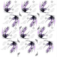
Our pattern symbolizes how three different cultures, Finnish, Latvian and German meet and join together. Swans’ entanglement means our young swinging team work. Patterns’ black and white coloring means exchange between day and night, darkness and lightness, and something about swans’ beautiness and its contact to the afterlife. Coloring also means a neutral attitude towards our cultural differences. Violet color freshens our pattern.
– Johanna – |
